Henri-Coanda-Airport-Redesign
Henri-Coanda-Airport-Redesign
Project Progression
UI/UX Design Personal Challenge: Redesign of “Henri Coanda” International Airport Site for web and mobile
About
What is Henri Coanda International Airport?
Henri Coanda is the main International Airport in Romania, located in Otopeni, near Bucharest, the capital city.
It is the busiest airport in the country, reaching its peak in 2023 with over 14 million visitors and passengers. Approximately 32 aircraft operate regular flights at this airport, both domestic and international.
Design Process
What steps did I take?
I followed a 5-step process that helped me create an efficient redesign of “Henri Coanda” International Airport’s Site for web and mobile.
I started by researching the current platform and conducting surveys to understand its usability from the perspective of potential users to comprehend the central problem/s that I will attempt to fix through my design.
Problem
Users experience difficulty in finding essential information about flights due to multiple links and sections available at the same time.
Solution
I want to redesign the site by offering a minimalistic interface which offers clarity of information and fluid and intuitive usage.
1
Research & Comparison
Information Architecture
Finding information about flights in detail is the users’ priority on the site
Web/Mobile Layout
Engaging in open conversations and being listened to helps the client feel supported.
Functionality
Users value the quality of information and efficient use of the site above the visuals.
2
User Flow
I utilised the data I collected from desk research, surveys and expert interviews as well as the results of the ideation process (diverging and converging) to create a user journey that shows the complete navigation flow of the application.
3
Wireframes
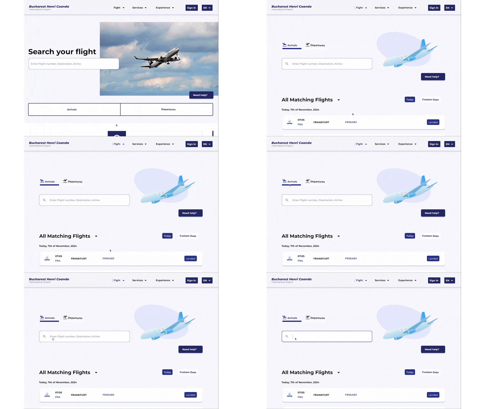
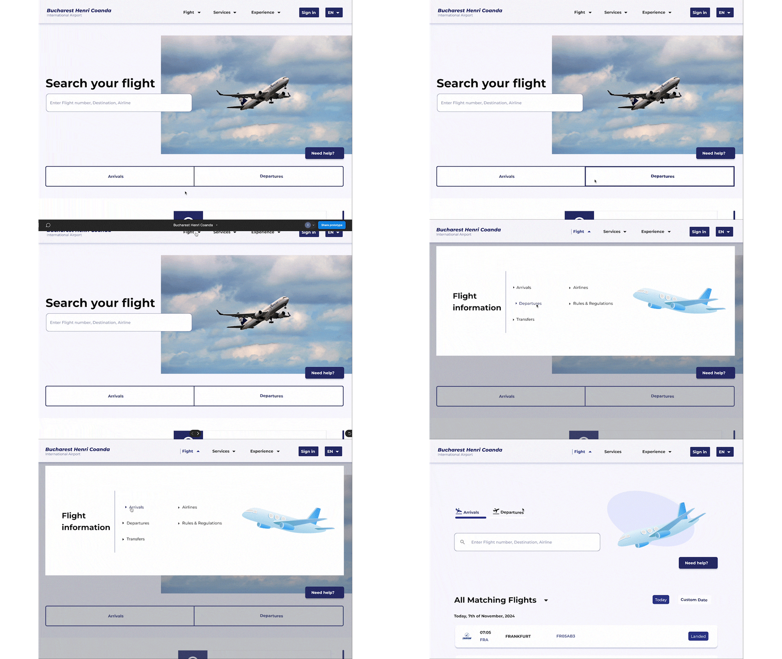
Flight Search bar immediatelly available as well as connections to general info, news and blog pages for easy access.
Landing page
Flights Page
Easy switch between Arrivals/Departures, drop-down flights search results, followed by useful steps to follow for the passangers
General info Page
Presents information immediately, followed by a step-by-step guide for passengers to follow and succeed easily. At the end of the page, visitors are met with more important info that might support their airport visit,
News Page
The heading is positioned at the beginning of the page to reassure the user that they are on their desired page. It is followed by the news segment, which is divided into short paragraphs to enhance readability. At the end of the age, visitors are met with an overview of more airport-related news to scan through.
Blog Page
On this page, the users can view the blog posts related to the most frequently asked questions by the visitors, It is a fast and efficient way to potentially find answers and resolve doubts related to the airport experience.
4
High Fidelity Design
Web Version
Web Version
Interactivity
Mobile Version
Style Guide
Typography
Colour Palette
5
Final Thoughts
My Learnings
Through this project, I learnt that a user-centred design in the context of public institutions and service providers focuses on functionality and efficient delivery of information, and less on aesthetics and overcrowding the pages with supplimentary visuals.
Possible Developments
The interactive elements of the platform can be fully developed, in order for me, as a designer, to obtain complete opinions on the final design. Also, in the cotext of future opportunities, I would contact the airport to also understand their professional perspective on their business and visitors.


